Creative
Thoughtful
Excellence
hectorosunadesign.com


- Project: ADI Global Distribution — Featured Brand Landing Page (Bosch)
- Role: UI Designer · Interaction Designer · Prototyper
- Date: 2024–2025
- Scope: Responsive UI, Component Library, Figma Prototyping, Developer Handoff
Objective
Design a conversion‑focused brand landing page that communicates vendor value, showcases featured products, and drives users to shop on ADIGlobal.com. Build with reusable UI components to streamline future brand pages and ensure consistency within the ADI design system.
High-Fidelity Prototype View Live Page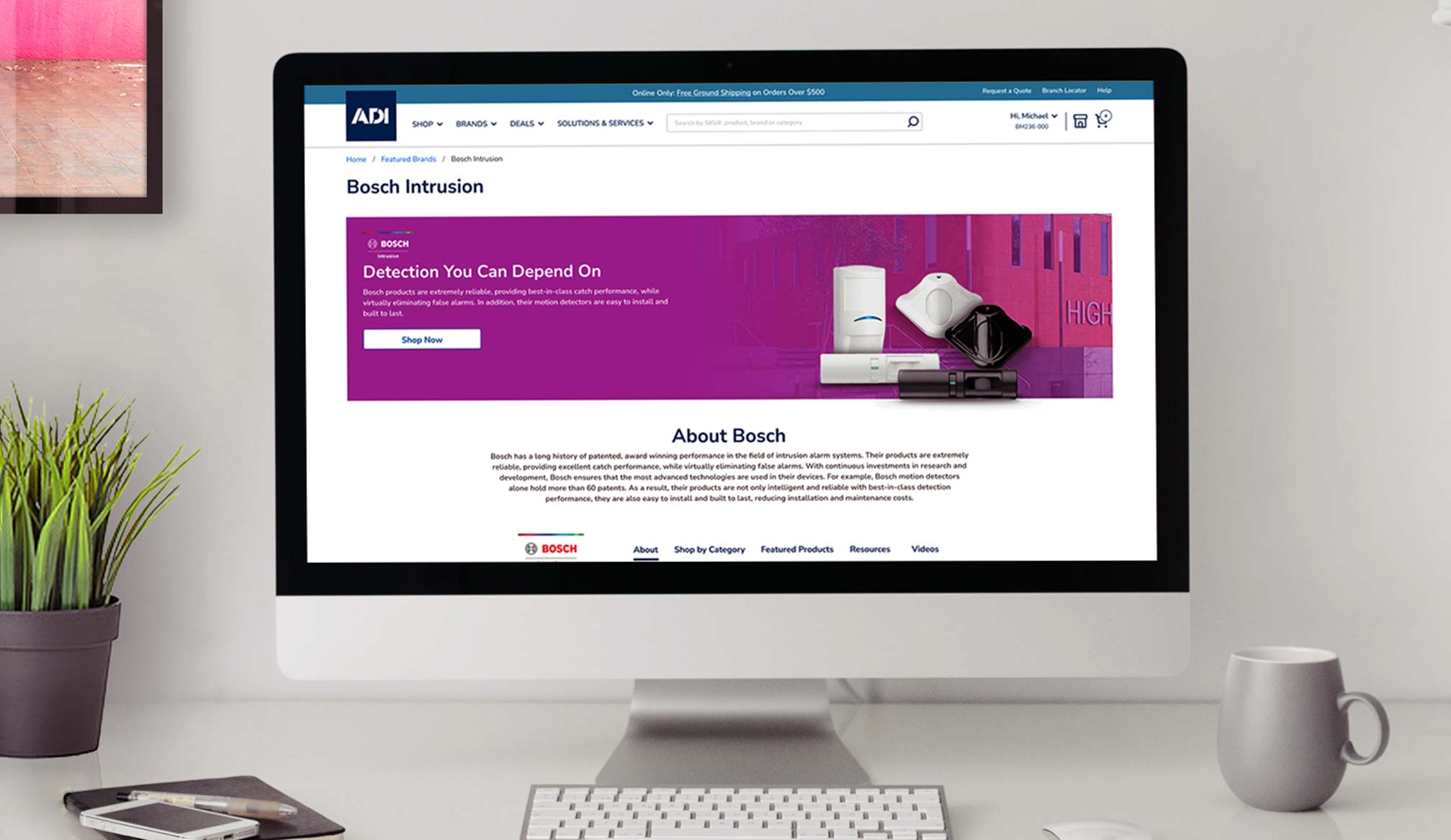
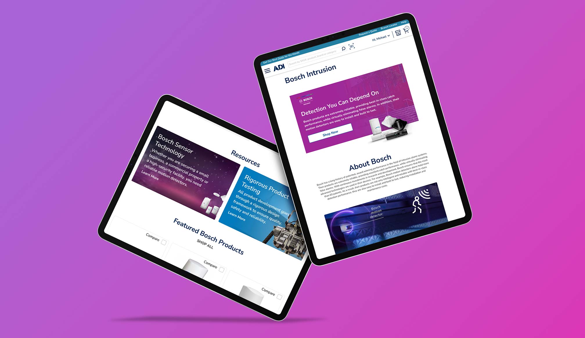
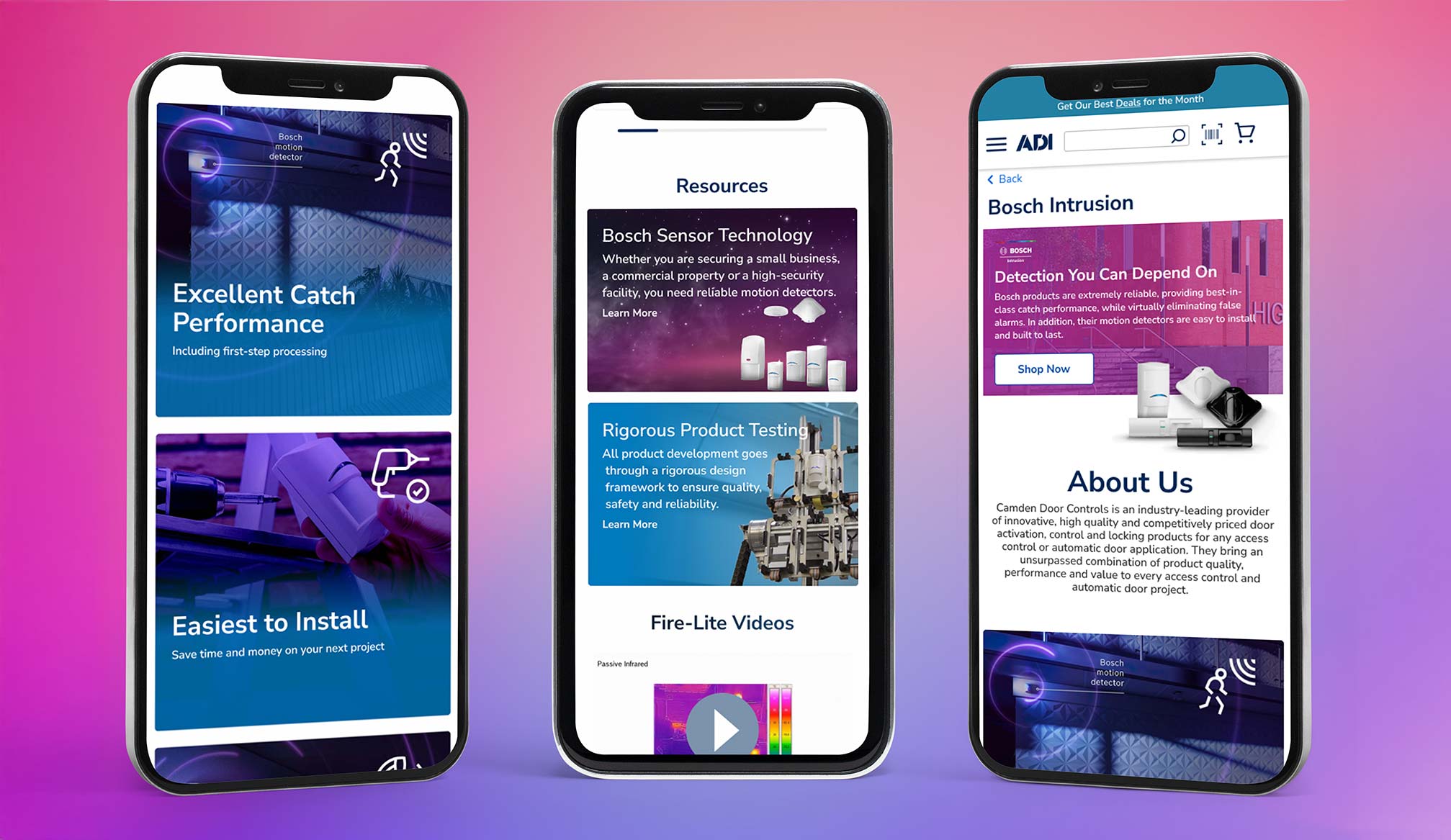
Objective
Design a high-impact Bosch brand page that effectively communicates product value, highlights featured solutions, and drives conversions on ADIGlobal.com. Build a scalable, component-based system for consistent future vendor pages.
Key Results
- +32% increase in click-through rate to Bosch product pages within first month.
- +21% growth in add-to-cart actions from landing page visitors.
- Average time-on-page up by 45 seconds due to improved layout and interactions.
- Zero accessibility violations at launch; WCAG AA compliant.
Key Responsibilities (UI Designer)
- Own the UI design for all modules: hero, value props, product carousels, solution tiles, proof (logos/testimonials), resources, and CTAs.
- Build a component library in Figma using variants, Auto Layout, and constraints to support desktop, tablet, and mobile.
- Create interactive prototypes with device‑specific flows and micro‑interactions for a realistic vendor review.
- Ensure responsive design, accessibility (color contrast, focus states, semantic structure), and content scalability.
- Collaborate with stakeholders and the vendor to align on messaging, product selection, and conversion goals.
- Package specs for developer handoff (tokens, spacing, type scale, redlines) and support QA to maintain fidelity.
Toolkit
- Figma (Components, Variants, Auto Layout, Prototyping, Design Tokens)
- Adobe Illustrator (iconography & SVGs)
- Zeplin / Inspect for CSS variables and specs
Component‑Driven Modules
- Hero with brand masthead, headline, and primary CTA
- Feature Grid for key value propositions
- Product Carousel with pricing, badges, and quick links
- Solutions Tiles that route into category pages
- Resources (datasheets, brochures, videos) with file‑type icons
- Social Proof / partner logos
- Lead Capture / secondary CTAs
Process
- Brief & Requirements: clarify KPIs (CTR to product pages, downloads, add‑to‑cart).
- Wireframes: map content hierarchy and responsive breakpoints.
- Visual System: align with ADI brand tokens (colors, type scale, spacing).
- Prototype: link flows; define hover/focus/pressed states and transitions.
- Review: vendor and internal stakeholder walkthroughs with comments resolved in Figma.
- Handoff & QA: specs, redlines, and issue tracking until launch.
Accessibility & Performance
- Meet or exceed WCAG AA contrast across modules.
- Keyboard‑navigable interactive elements; visible focus states.
- Optimized asset pipeline: SVG icons, responsive images, and lazy‑loading guidance.
Impact
Delivered a scalable, component‑based landing page pattern that reduces design and development time for future vendor pages while improving clarity and driving users deeper into the purchase journey. The live Bosch page reflects the component library, responsive UI, and interaction patterns defined in the prototype.